[업무 지식]/Machine learning
[선형회귀] 회귀분석
에디터 윤슬
2024. 11. 18. 20:42
선형회귀 함수 정의
# 회귀분석 함수
def get_linear_regression(X, y, n_components = 1):
# 훈련 및 테스트 데이터 분리
from sklearn.model_selection import train_test_split
from sklearn.linear_model import LinearRegression
from sklearn.preprocessing import StandardScaler
from sklearn.metrics import mean_squared_error, mean_absolute_error, r2_score
from sklearn.decomposition import PCA
scaler = StandardScaler()
X_scaled = scaler.fit_transform(X)
# PCA 적용
pca = PCA(n_components=n_components) # n_components: 축소할 차원 수
X_pca = pca.fit_transform(X_scaled)
X_train, X_test, y_train, y_test = train_test_split(X_pca, y, test_size=0.2, random_state=42)
model_lr = LinearRegression()
model_lr.fit(X_train, y_train)
# 모델 예측
y_pred_lr = model_lr.predict(X_test)
# 정확도 측정
print('train 정확도:', model_lr.score(X_train, y_train))
# 정확도 측정
print('test 정확도:', model_lr.score(X_test, y_test))
# 산점도와 회귀선 그리기
plt.figure(figsize=(10, 6))
sns.regplot(x=X_test, y=y_test, scatter_kws={'alpha':0.6}, line_kws={'color':'red'})
plt.title("Scatter Plot with Regression Line")
plt.xlabel("X (Independent Variable)")
plt.ylabel("y (Dependent Variable)")
plt.show()
# # 모든 변수의 회귀선 그리기
# for i in range(X.shape[1]):
# plt.figure(figsize=(10, 6))
# sns.regplot(x=X_scaled[:, i], y=y, scatter_kws={'alpha': 0.6}, line_kws={'color': 'red'})
# plt.title(f"Scatter Plot with Regression Line (Feature {i+1})")
# plt.xlabel(f"Feature {i+1}")
# plt.ylabel("y (Dependent Variable)")
# plt.show()
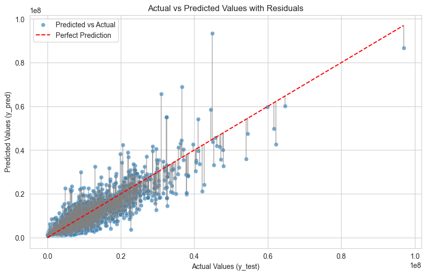
# 실제 값 vs 예측 값과 잔차 표시
plt.figure(figsize=(10, 6))
# 산점도: 실제 값 vs 예측 값
sns.scatterplot(x=y_test, y=y_pred_lr, alpha=0.6, label="Predicted vs Actual")
# 잔차를 선으로 연결
for i in range(len(y_test)):
plt.plot([y_test.iloc[i], y_test.iloc[i]], [y_test.iloc[i], y_pred_lr[i]], color='gray', alpha=0.5)
# 대각선(완벽한 예측선)
sns.lineplot(x=[y_test.min(), y_test.max()], y=[y_test.min(), y_test.max()], color='red', linestyle='--', label="Perfect Prediction")
plt.title('Actual vs Predicted Values with Residuals')
plt.xlabel('Actual Values (y_test)')
plt.ylabel('Predicted Values (y_pred)')
plt.legend()
plt.show()
# 평가 지표 계산
mse = mean_squared_error(y_test, y_pred_lr) # 평균 제곱 오차
mae = mean_absolute_error(y_test, y_pred_lr) # 평균 절대 오차
r2 = r2_score(y_test, y_pred_lr) # R^2 점수
# 평가 지표 출력
print(f"Mean Squared Error (MSE): {mse:.2f}")
print(f"Mean Absolute Error (MAE): {mae:.2f}")
print(f"R^2 Score: {r2:.2f}")
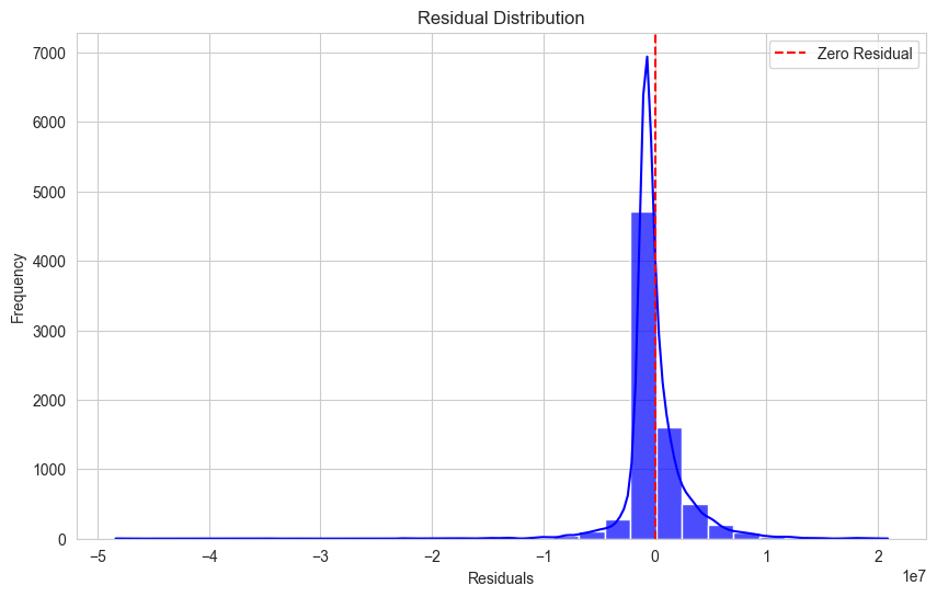
residuals = y_test - y_pred_lr
plt.figure(figsize=(10, 6))
sns.histplot(residuals, kde=True, bins=30, color='blue', alpha=0.7)
plt.axvline(x=0, color='red', linestyle='--', label="Zero Residual")
plt.title('Residual Distribution')
plt.xlabel('Residuals')
plt.ylabel('Frequency')
plt.legend()
plt.show()
# Z-score 이상치 제거
def get_outlier_zscore(df):
col = ['amount']
zscore_cnt = {}
from scipy import stats
for column in col:
mean = df[column].mean()
std = df[column].std()
z_scores = (df[column] - mean) / std
abs_z_scores = np.abs(z_scores)
threshold = 3
outlier = abs_z_scores > threshold
inlier = abs_z_scores <= threshold
outlier_cnt = df[outlier].shape[0]
zscore_cnt[column] = outlier_cnt
df = df.loc[inlier]
print('컬럼별 이상치 갯수:', zscore_cnt)
return df
# 독립변수, 종속변수 선언
df = customer_info.copy()
lr_df = get_outlier_zscore(df)
X = lr_df[['CLICK', 'SCROLL', 'SEARCH', 'ADD_TO_CART', 'ADD_PROMO',
'ITEM_DETAIL']]
# X['mean'] = (X.sum(axis=1) / X.columns.nunique()).round(2)
y = lr_df['amount']
# get_linear_regression(X[['mean']], y)
get_linear_regression(X, y)train 정확도: 0.8189672490949147
test 정확도: 0.8170546090423936
Mean Squared Error (MSE): 7207851011240.83
Mean Absolute Error (MAE): 1576086.65
R^2 Score: 0.82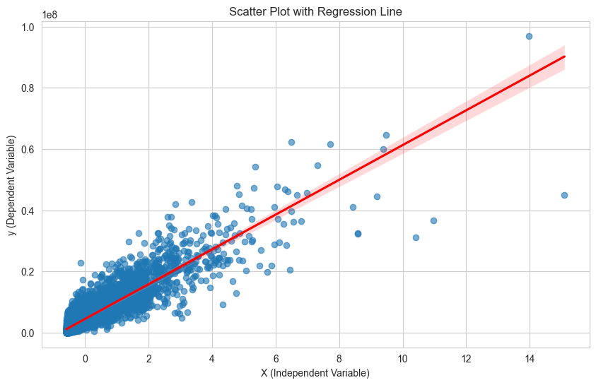
자주 쓰는 함수
- sklearn.linear_model.LinearRegression: 선형회귀 모델 클래스
- coef_: 회귀 계수
- intercept: 편향(bias)
- fit: 데이터 학습
- predict: 데이터 예측
선형회귀 실습
'tips' 데이터를 가지고 전체 금액(X)를 알면 받을 수 있는 팁(y)에 대한 회귀분석을 진행한다.
- seaborn 시각화 라이브러리 데이터셋 'tips'
tips_df = sns.load_dataset('tips')
tips_df.head(3)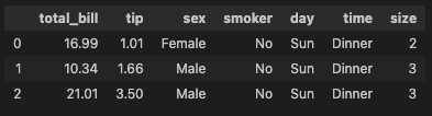
- 전체 금액(total_bill)과 팁(tip)과의 선형성을 산점도로 확인한다
sns.scatterplot(data = tips_df, x = 'total_bill', y = 'tip')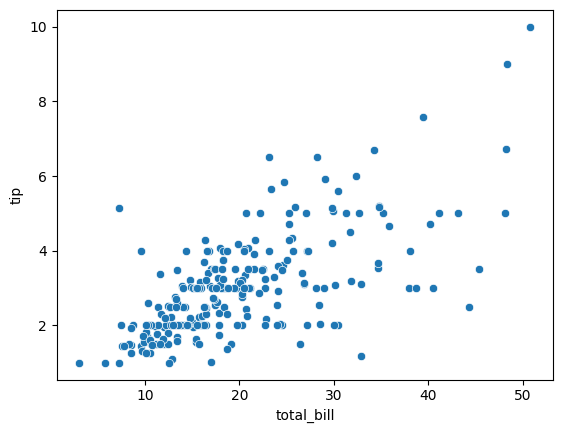
- 종속변수(y), 독립변수(x) 설정
# X: total_bill  -- X, 대문자
# y: tip

model_lr = LinearRegression()
X = tips_df[['total_bill']]
y = tips_df[['tip']]
model_lr.fit(X, y)
- 편향(w0), 회귀계수(w1) 설정
# y(tip) = w1 * x(total_bill) + w0

w1_tip = model_lr.coef_[0][0]
w0_tip = model_lr.intercept_[0]

print('y = {}x + {}'.format(w1_tip.round(2), w0_tip.round(2)))

y = 0.11x + 0.92

# 전체 결제금액이 1달러 오를때, 팁은 0.11달러 추가된다.
# 전체 결제금액이 100달러 오를때, 팁은 11달러 추가된다.- 예측값 생성
y_true_tip = tips_df['tip']
y_pred_tip = model_lr.predict(tips_df[['total_bill']])
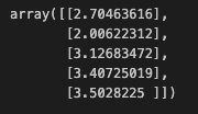
y_true_tip[:5]
y_pred_tip[:5]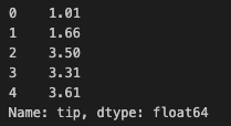
- MSE, rsquare 설정
mean_squared_error(y_true_tip, y_pred_tip)
1.036019442011377

r2_score(y_true_tip, y_pred_tip)
0.45661658635167657- 예측값 df에 추가
tips_df['pred'] = y_pred_tip
tips_df.head(3)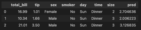
- 산점도와 라인플롯 시각화
sns.scatterplot(data = tips_df, x = 'total_bill', y = 'tip')
sns.lineplot(data = tips_df, x = 'total_bill', y = 'pred', color = 'red')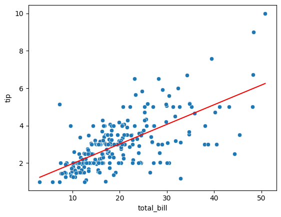
범주형 데이터 선형회귀
- 범주형 데이터 숫자로 인코딩
# female 0 , male 1

def get_sex(x):
	if x == 'Female':
    	return 0
    else:
return 1- apply 함수 적용
tips_df['sex_en'] = tips_df['sex'].apply(get_sex)
tips_df.head(3)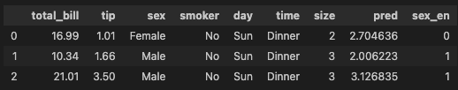
- 모델 설계도 가져오기, 학습, 평가
model_lr2 = LinearRegrssion()
X = tips_df[['total_bill', 'sex_en']]
y = tips_df[['tip']]
model_lr2.fit(X, y)- 예측
y_pred_tip2 = model_lr2.predict(X)
y_pred_tip2[:5]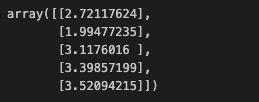
- MSE, Rsquare 확인
# 단순선형회귀 mse: X변수가 전체 금액
# 다중선형회귀 mse: X변수가 전체 금액, 성별
print('단순선형회귀', mean_squared_error(y_true_tip, y_pred_tip))
print('다중선형회귀', mean_squared_error(y_true_tip, y_pred_tip2))

단순선형회귀 1.036019442011377
다중선형회귀 1.0358604137213614

print('단순선형회귀', r2_score(y_true_tip, y_pred_tip))
print('다중선형회귀', r2_score(y_true_tip, y_pred_tip2))
단순선형회귀 0.45661658635167657
다중선형회귀 0.45669999534149974